OPR
An Ogilvy Company
Australia’s largest public relations and communications agency, Ogilvy PR Australia, has rebranded to opr and established itself as a separate entity within WPP AUNZ.
The new opr agency visual identity signifies a nod to its Ogilvy heritage, a new direction and a new phase in the agency’s history as it leaves the Ogilvy network.
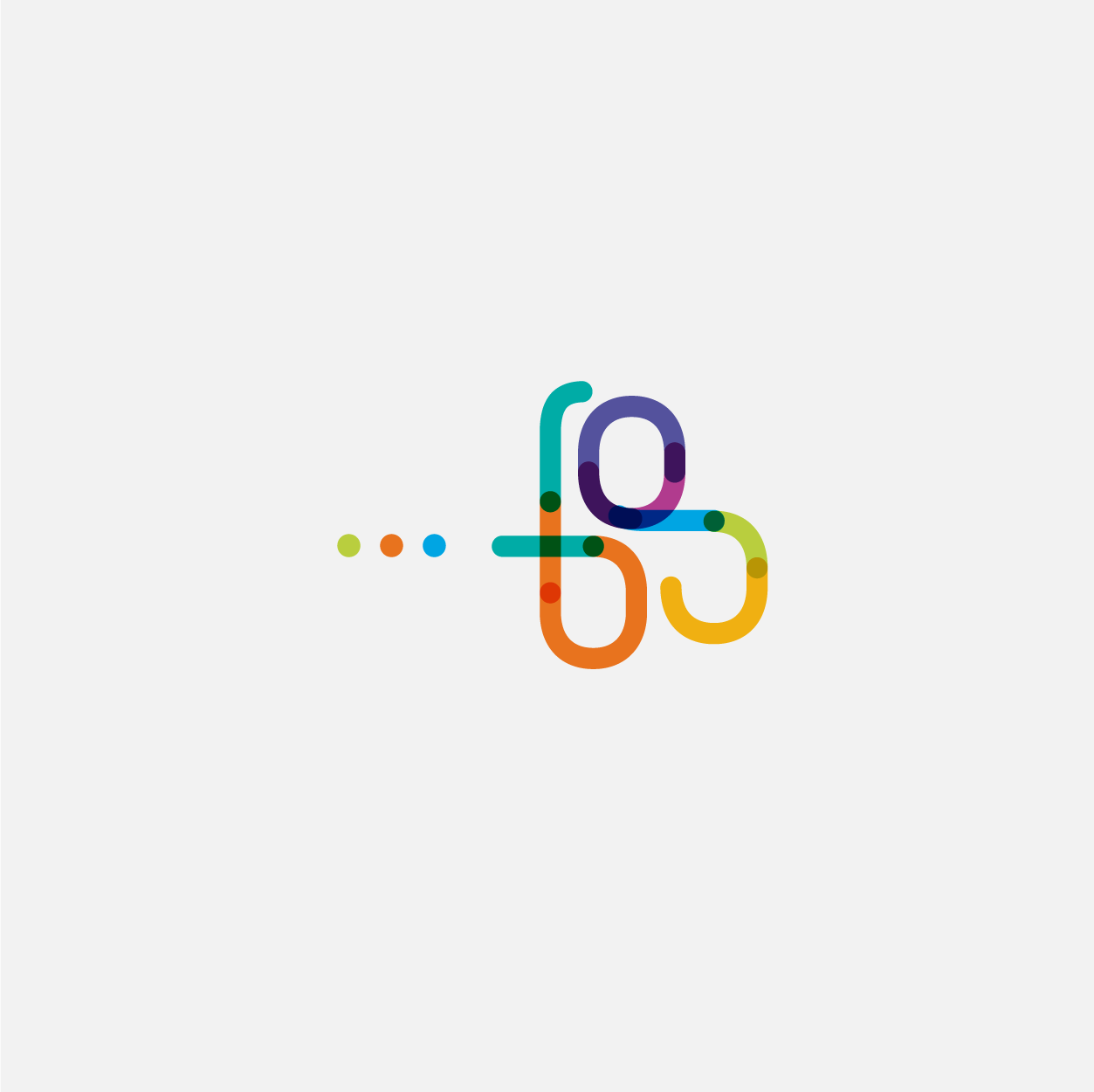
The ellipsis device following ‘opr’ is a language device that can be interpreted as being a ‘leading statement’ and placing the ellipsis after ‘opr… ‘ in the word mark conveys the idea of the beginning of something, an ongoing dialogue, an engagement and response to client needs. It is a visual way of showing the way forward. It’s the beginning of something big.
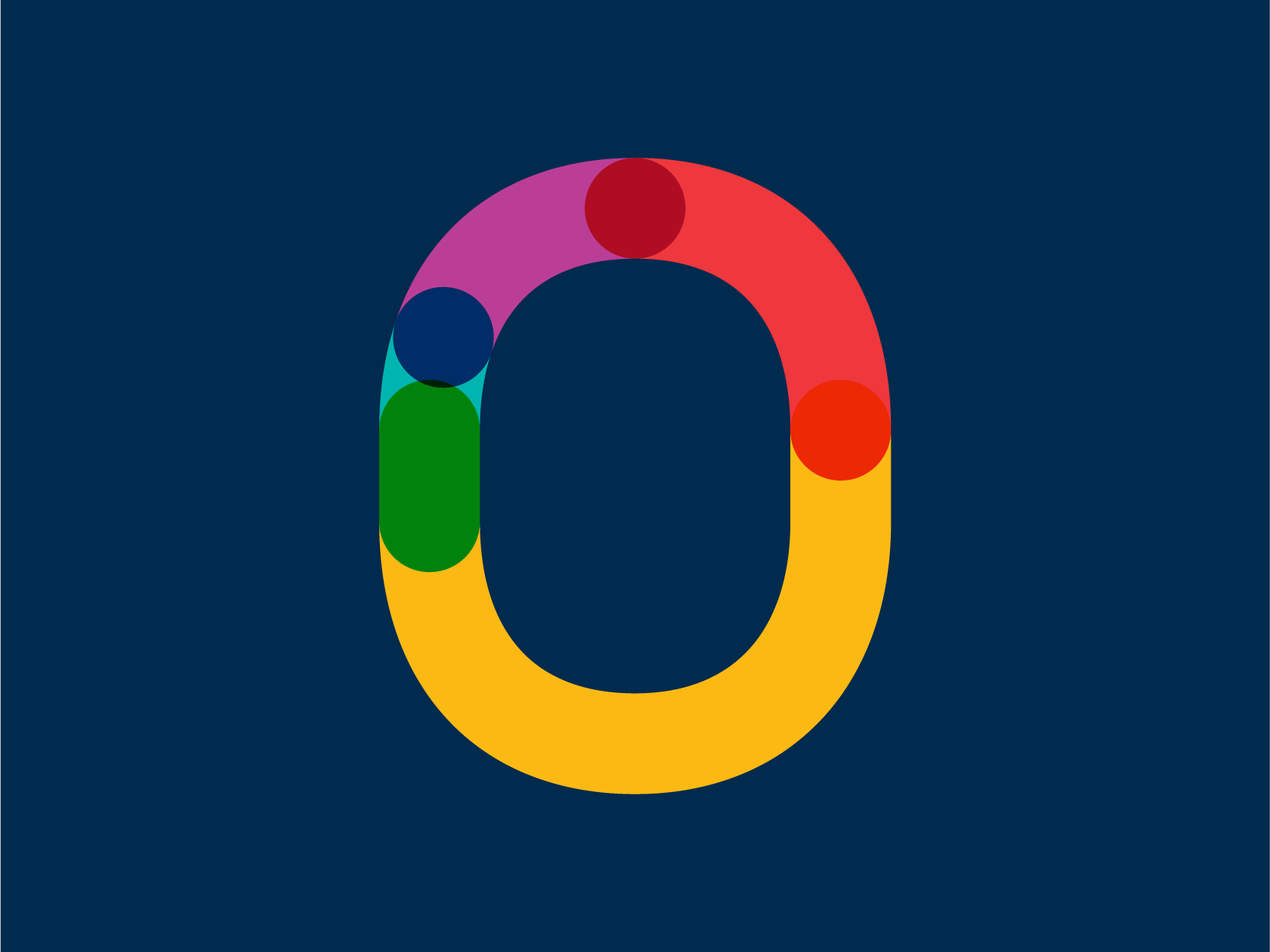
The graphic elements represented in various colours that make up the ‘opr’ logotype are representative of the overall ‘opr’ client service offer being greater than the sum of its individual staff contributions. Within the visual identity, the individual parts within the logotype are broken out in a pattern format to create visual interest.
The ‘opr’ visual identity has transparency and constructed honesty supporting the new tagline ‘Believability is our business’. The ‘opr’ colour palette is bright and allows for visual delineation of the various internal practice areas.
Scope of work:
Brand guidelines, digital templates, collateral materials, infographics design.
*Project developed at Entica Design Strategy.


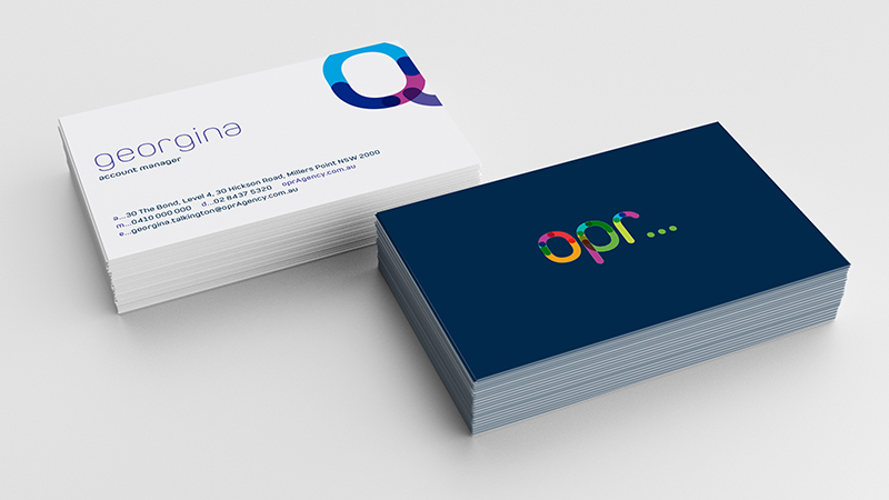
Stationery Design.

Corporate Cover Concept.

Business Card Design


Typography and pattern applied to collateral applications.
